Posts Tagged 'T-shirt'

Filming Part Two.

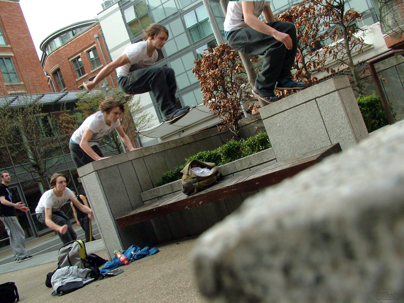
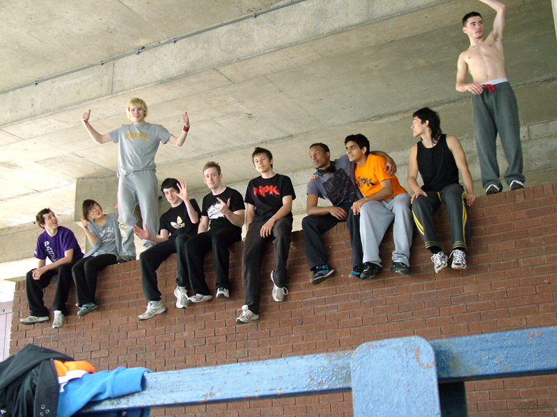
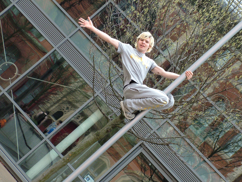
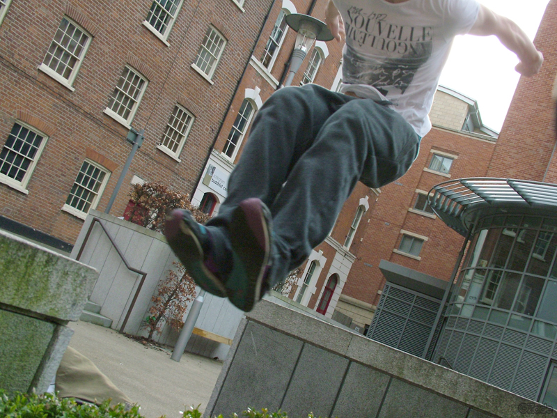
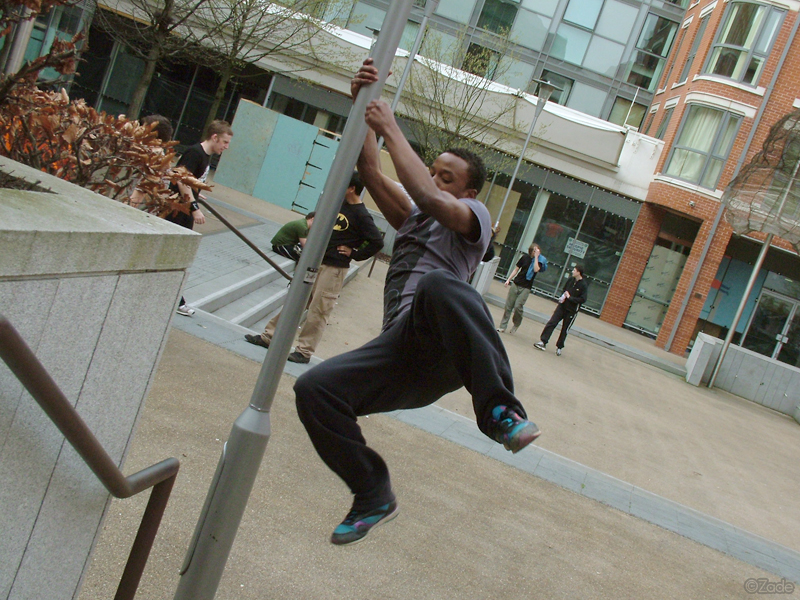
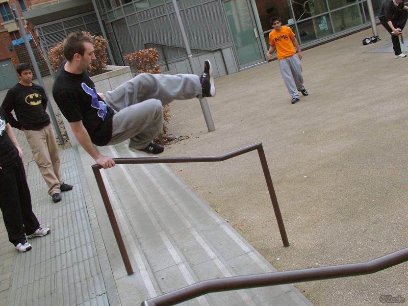
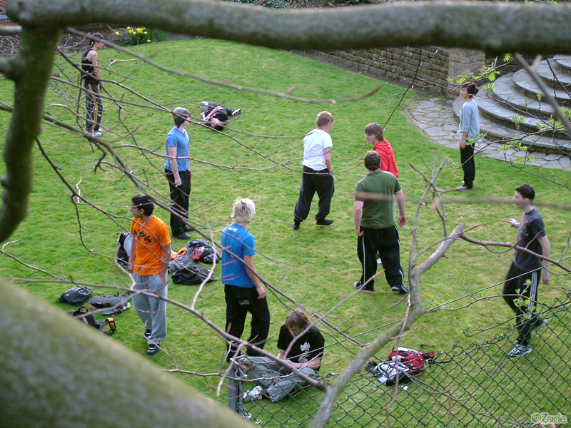
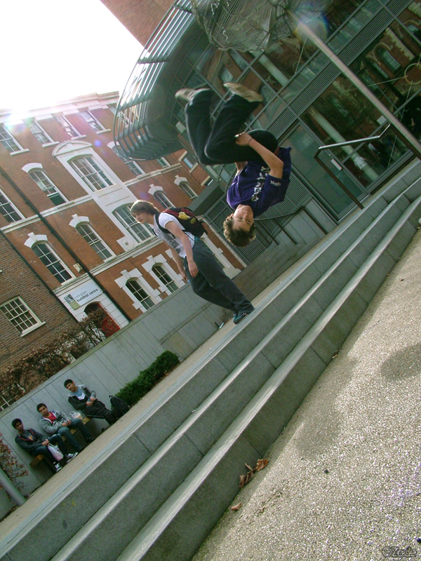
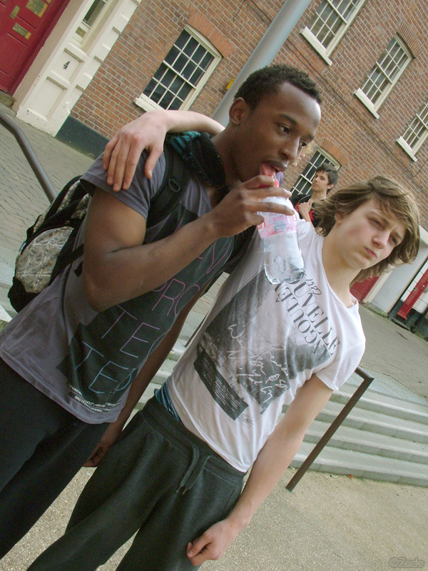
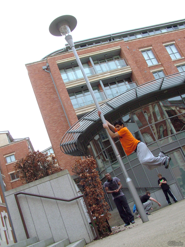
It wasn’t until I was home and knuckling down with the edit from the day that I realised I had a total of 65 clips! I expected much of that may be of a singular person or various takes of a movement, maybe eight per person. As Patryk was kind enough to point out it might be of only ‘rubbish’ failing! Much to his credit, he was wrong as much of my footage was all different clips, my only disappointment, like with any filming project I do, was the lack of self footage I had NOT acquired…

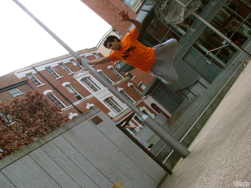
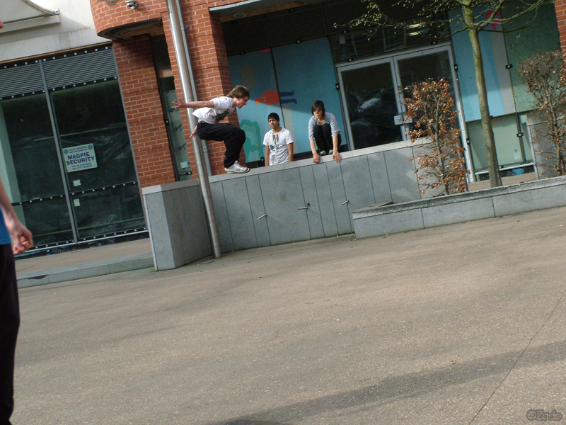
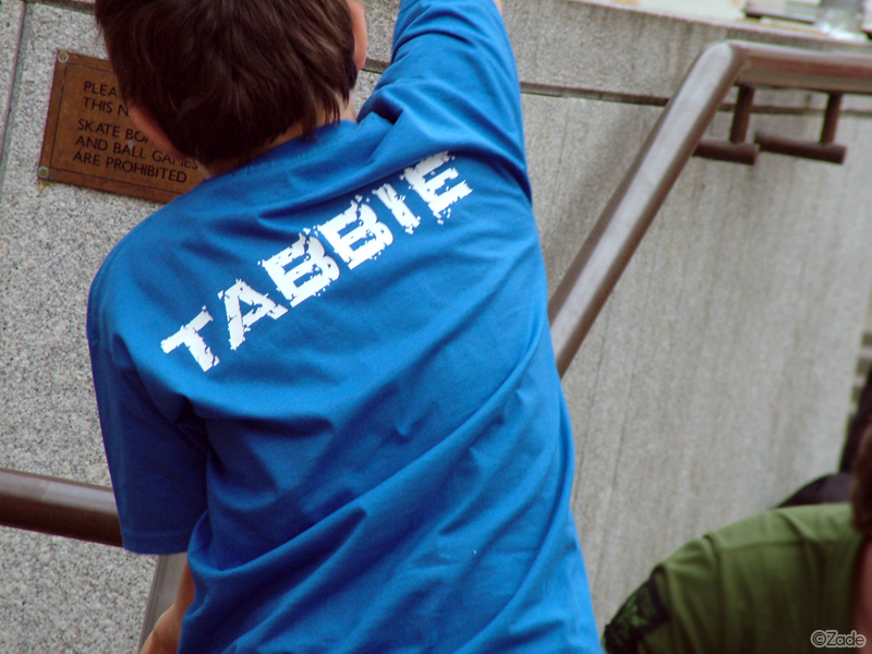
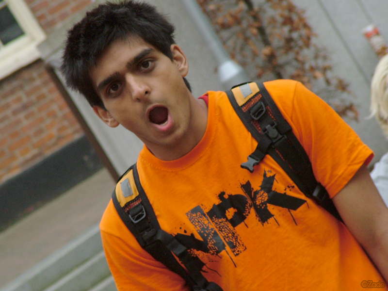
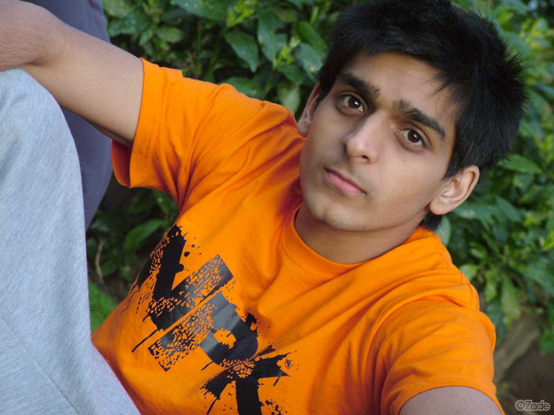
I will admit there was a fair bit of Patryk in the clips, multiple clips of him failing, messing up and a fair amount of David too, overall more than the rest of us. Once all clips were inserted on to the sequence it came to around to the eighteen minute mark, wowzers and that didn’t include last weeks! That was a lot of clips to sieve through to pick the best, edit down and so forth. I did in time manage to get it down to thirteen minutes, which wasn’t as low as I would have liked or expected!

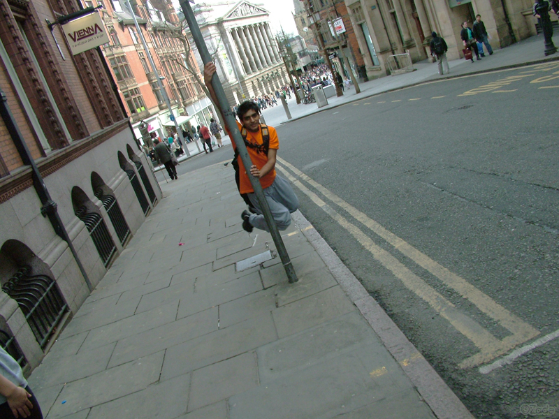
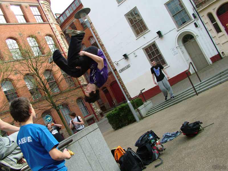
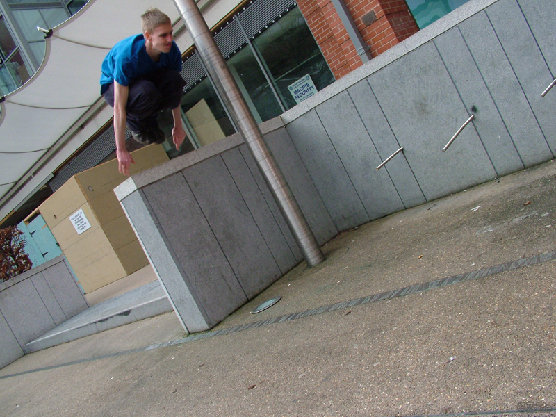
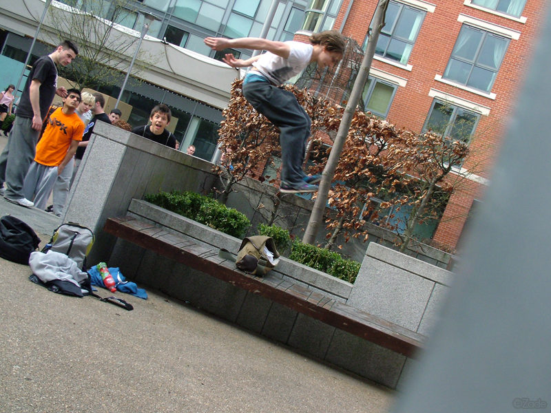
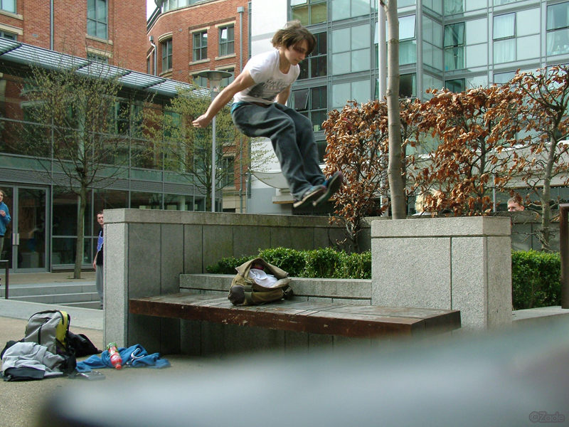
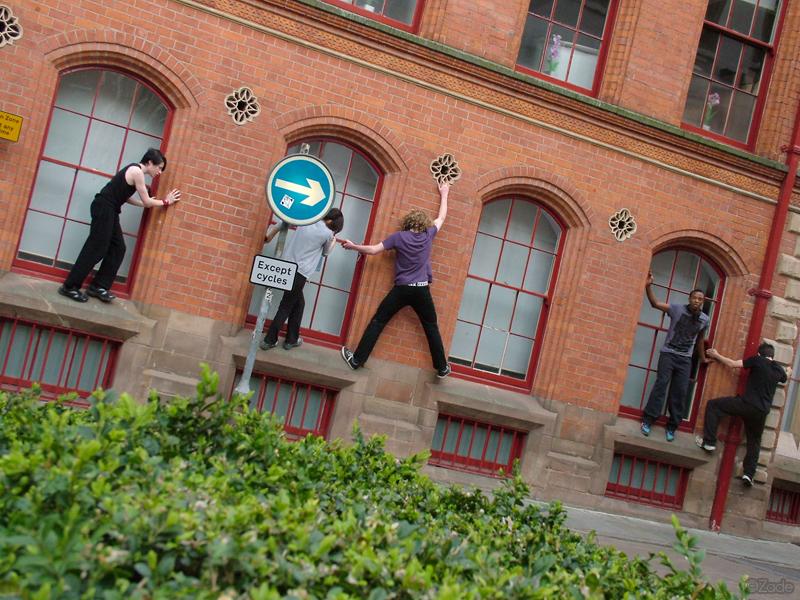
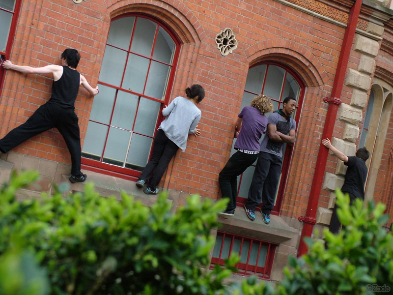
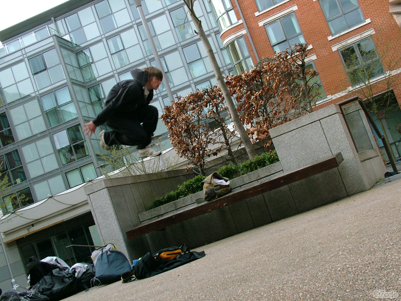
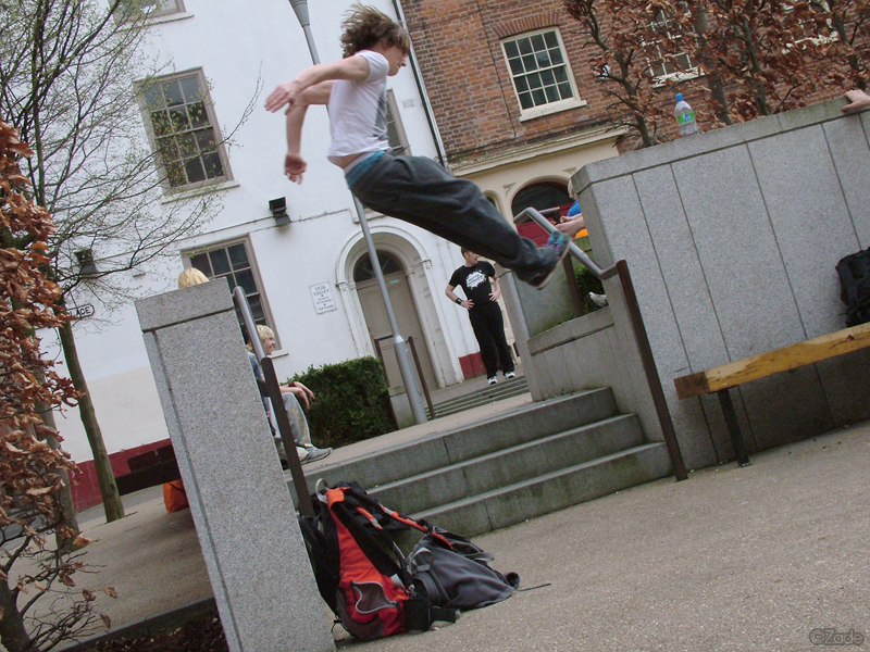
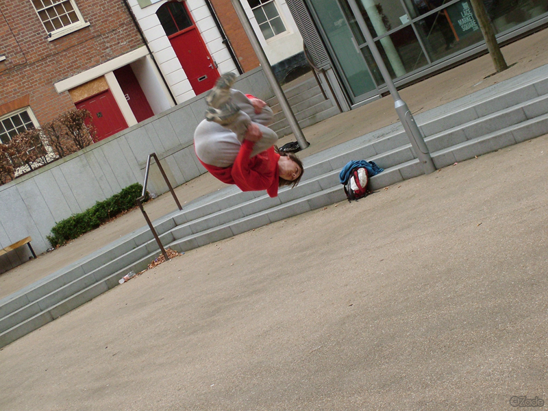
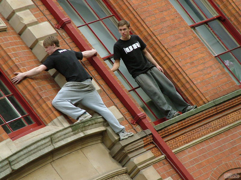
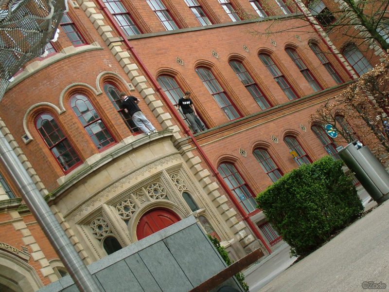
I did want a sort of intro for the video, like I had done for previous days. (1) (2) plus I didn’t want it long! The multi angle shots I merged together, didn’t quite work as well as I had liked. The same went for the shot where we passed around the camera between each other as we did movements. That concept loo Kurd bc and felt brilliant. I do feel cutting all the shots together did work, nicely though, at least to me. As you can see below to judge!

Day’s Edit!

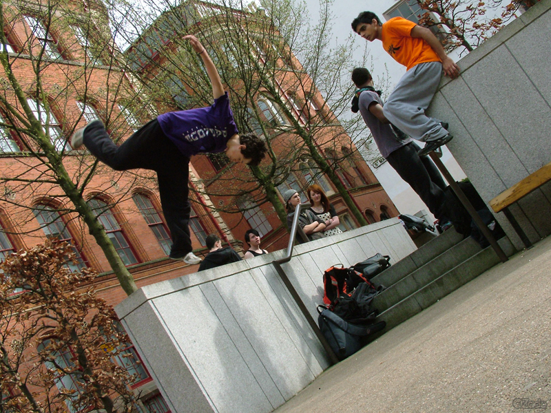
For me, the biggest part was trying to get singular shots in there of everybody equally, along with some multi angled ones and making sure each person had enough or the same air time as one another! I know one day I spent near four hours just zoning out at the screen. Editors block, unable to really create anything and proceed any further! Thankfully Ash the impeccable came up with a tune for the video which worked and then I began to edit again!

Continue reading ‘Filming Part Two.’

Npk – Creating Movement t-shirt.

This is the thirteenth Nottingham Parkour [1] [2] [3] [4] [5] [6] [7] [8] [9] [10] [11] [12] t-shirt to be created. I hadn’t realised how much time had passed since the last Jumpin’ one was created, which was back in 2012. I wanted to have a new t-shirt design, something fresh now I was back out training after a few nightmare years of being unable to. I also wanted something with more of a general apparel to it and what better way, than to create something summery. At least that was the concept for this next shirt, I had no idea how I would portray that on a design though. So it was to be a long and slow process over the next few months of creating it.

I had the blueprints for the Npk letters on the left, which I had used within the slant design, as well as using it on the corner of recent Nottingham Parkour videos. I have always enjoyed the simplicity of that logo. So I started from there with the design, creating a mirror of the letters, keeping them slanted and finally added a slight boarder too. Then I created the block white and the tag line ‘creating movement’. Then I added the three lines above the NPK. The rest of the design came together very slowly, lots of experimenting with things, doing a bit, then coming back to it at a later date. There was lots of having the design open on Photoshop and just staring endlessly at the screen with not much being altered, wondering if I would ever be happy and finish it.


Creating Movement Design.


Now, obviously the buildings were a given to represent Parkour, like many t-shirts have these days. You may notice they aren’t Nottingham’s skyline, which I would have used if they was half decent like other countries out there. What else could I use that represents Nottingham famously instead? The plant vines and general shrubbery added a nice feel to the design and then allowed me to start to add other things like other summer-eske things; rain clouds, the moon, birds, butterflies, drinks, palm trees and all the other small fiddly details. I always liked the idea of a heartbeat rhythm line as an idea to represent something which changes as we train due to adrenaline, fear etc. However, the original heartbeat didn’t fit with the design, so I turned it upside down looked and worked better. There are some four leaf clovers in the design too, meaning we make our own luck.

Believe it or not the tic tac cat silhouette came near the end of designing, when I felt it needed a Parkour movement to be thrown in there to give it the pk stamp on the design. The Pokéball was an extra and last minute thing due to PokémonGO being so popular this year. I think this t-shirt is pretty complex in many ways, not as bad as the Roadkill design as that had lots of fiddly bits in it. But, in the sense of it being well thought out and having lots to the acctual design in look and meaning. I’m really pleased with how it looks in person after being printed, more than I was expecting and I hope in time it will become a new community favourite. Below are some images of the design on a navy, purple and azure blue t-shirt.


New Photography!

Today has been a very long, awesome day. I have been taking photos all day when I haven’t been training. Due to an injury in the afternoon, well I say injury and yet have no idea why my knee hurts at the side. I spent more time taking photos then in the morning. It has been very fun to capture a wide variety of photos without aiming to in the beginning to take anything at all. I was trying to this time round to make sure I was more aware of my surroundings and subjects for photos and try to incorporate them into the images.

Near the end of the session, I also took some portrait photos to experiment with. At the start of the day after a warm up, I began to film another run for the Npk Project and managed to do not just one, but two sections for it, which are in the same areas. Although, I feel I may have to blend two separately rather then together as one big scene, but time will tell once I’m in the editing room.


Parrish – Kong Precision.


Npk – T-shirt.


Charlie – Portrait.


Group Photo.


Yaz – Pole Swinging.


Yaz – Pole Swinging.


Webster – Kong Precision.


Parrish – Webster.


Will – Sideflip.


Will – Sideflip.


Andy – Portrait.


David – Kong.


Parrish – Kong Precision.


Parrish – Kong Precision.


Parrish – Kong Precision.


Stefano – Pole Swing.


Climbing Mission.


Climbing Mission.


Flip – Lazy Vault.


Ben – Handstand.


Webster – Kong Precision.


Jp – Portrait.


Parrish – Kong Precision.


Tom – Sideflip.


Climbing Mission.


Climbing Mission.


Stef & Moonie.


Parrish & Ben.


Tabbie.


Yaz – Portrait.


Parrish – Portrait.


Yaz – Portrait.


Tricking.


Space Invader.


Trainers.


Will – Sideflip.


Stef & Parrish.


Stefano – Pole Swing.


Yaz – Pole swing.


Yaz – Pole Swing.


Parrish – Webster.


Parrish – Portrait.


Stef & Parrish.


Stef – Portrait.


Parrish – Portrait.


Npk – Roadkill t-shirt.

The eighth [1] [2] [3] [4] [5] [6] [7] Nottingham Parkour t-shirt design. I have recently been trying to create a new t-shirt for the community to wear, after the ever so popular Splat design which is worn by many and has so far been the most popular Npk t-shirt to date. I’m overwhelmed by just how well perceived it was at the time and how popular it has become overall. I don’t think I have ever had any expectations to ever top that design if I’m honest. No matter how many times I spent in Photoshop trying to mimic and create designs, nothing came out as well or close to the ‘Splat’ design.

I decided to go for another grunge and urban style design. This time I wanted to use the letters Npk which we us abbreviate Nottingham Parkour too. I wanted the letters to be worn and damaged and so I began to distort the letters. The first thought was a giant tyre mark across all the letters. But that seemed to be too basic or didn’t fit with what we practise.  After weeks of tweaking and adding different tears and paint splats I gave up on the idea entirely!


Npk – Roadkill Design.


I came back to it weeks later and started to warm to the design more and decided to post up the prototype to see what others though of the design, thinking it would not get much attention at all. How wrong was I, it had the total opposite affect with people really loving it and wanted to order one already! That took me by surprise, could this be a new favourite? I carried on tweaking the letters, adding paint drips, a space invader and some other hidden things within the design. The scratch marks on the letter N came much later, as you’ll see some of the earlier ones didn’t have that.

Fast forward a few months since and I have to say, even though it went into printing from the end of January, the result has been overwhelming. I would say it has easily taken over the ‘Splat’ design in popularity. Many people are wearing it, at training sessions there were sessions where nearly everyone was wearing a Roadkill t-shirt! Though, that could be down to the recent influx of new people to the Npk community. I think that has also increased the success of this design. It’s nice to see such a wide range of colours for the Roadkill design too, with everyone wanting to have their own individual colour to be unique.

I know many people have spoke about how it makes us feel more of a community when we are all wearing an Npk t-shirt. It gives people something to feel apart of and supports what they practise and the community too. I guess once this design becomes less popular, much like the Splat one has now. I will no design try and make a new design for the community further down the line. Below are many images of the design, in various colours.


Traffic Love.

  • 89,641 Hits
Follow Zade's Training Blog. on WordPress.com

Post Archives.

Enter your email address to follow this blog and receive notifications of new posts by email as and when they are created.